Energy • January 30, 2025
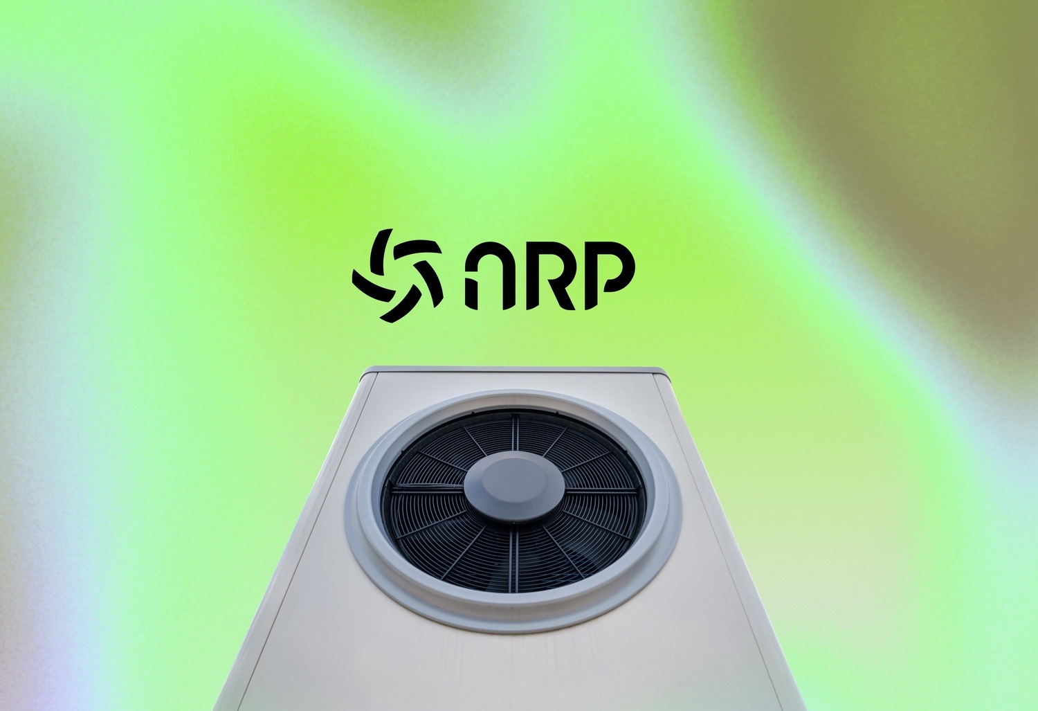
ARP
ARP is an innovative company specializing in energy efficiency solutions, with a strong focus on heat pump technology. Our goal was to create a comprehensive brand identity that positions ARP as a leader in sustainable energy solutions, appealing to both eco-conscious consumers and forward-thinking businesses.
Brand Concept
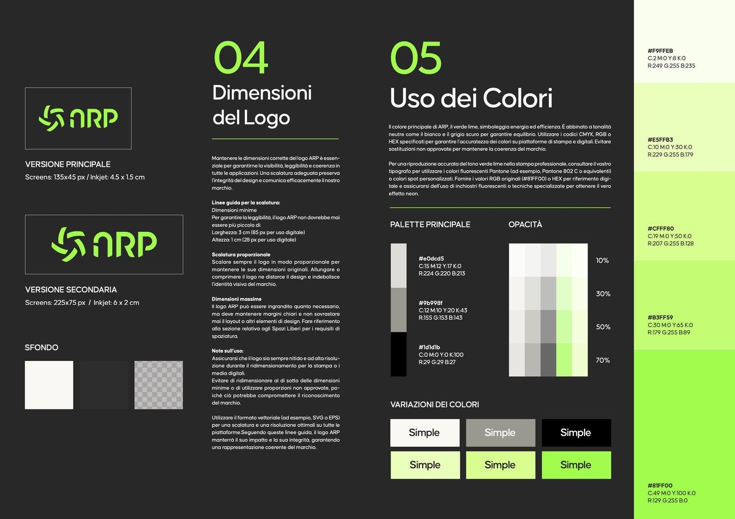
The branding for ARP embodies innovation, sustainability, and user-centric design. The circular, airflow-inspired logo symbolizes energy flow and continuous efficiency, while the fresh green palette communicates ARP’s commitment to environmental responsibility. A strong balance of black and white elements emphasizes modernity and trustworthiness.
Key Deliverables
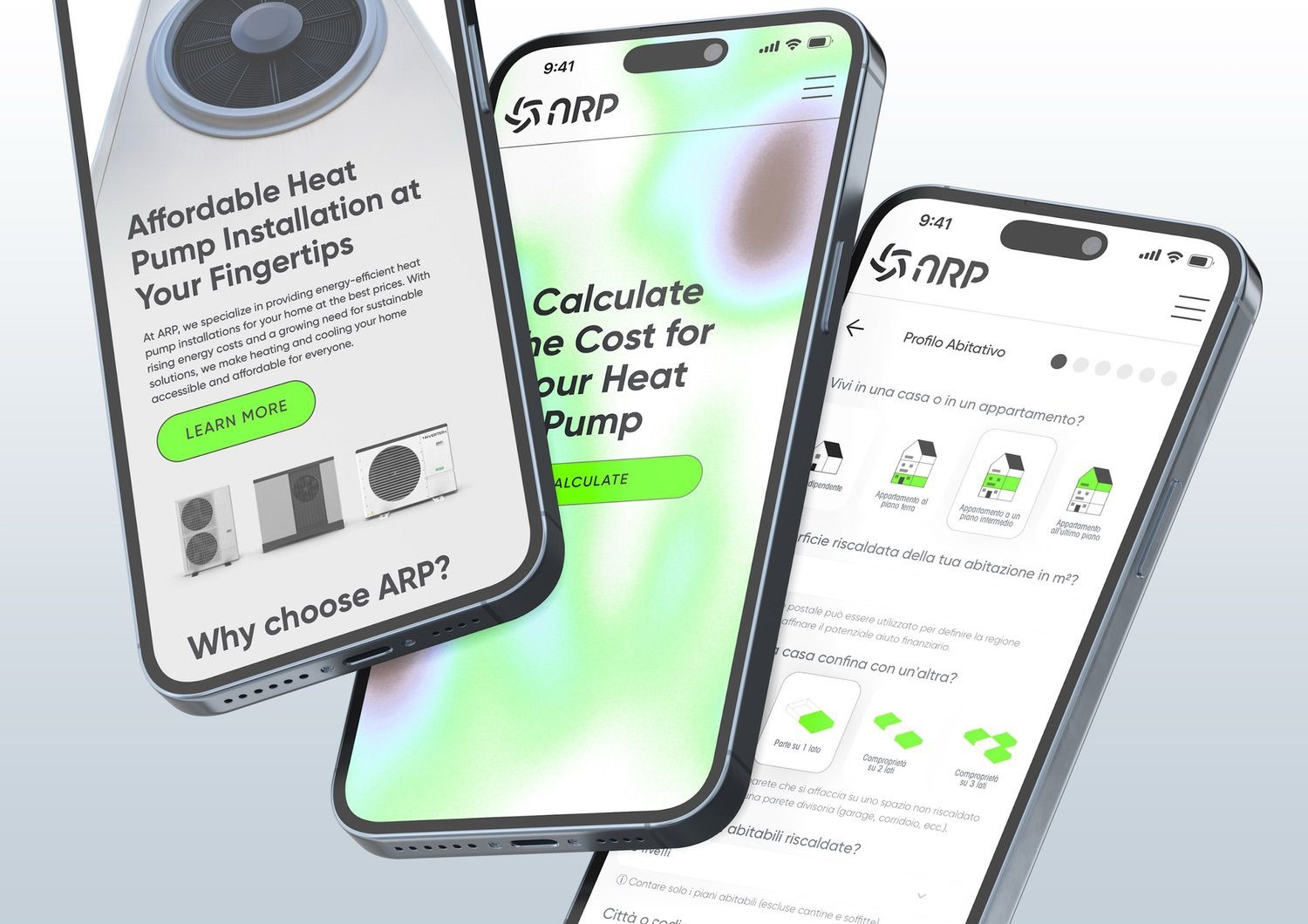
Logo & Visual Identity
- A modern, scalable logo with both primary and secondary versions designed for versatility across digital and physical applications.
Marketing Materials
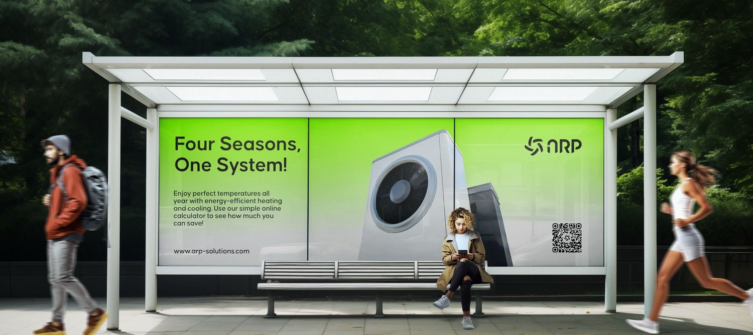
- Bus stop advertisements with striking visuals and QR codes for interactive engagement.
- Promotional banners showcasing ARP’s “Four Seasons, One System” message, emphasizing year-round energy solutions.
Digital Interface Design
- A responsive, user-friendly UI for ARP’s online cost calculator and service exploration.
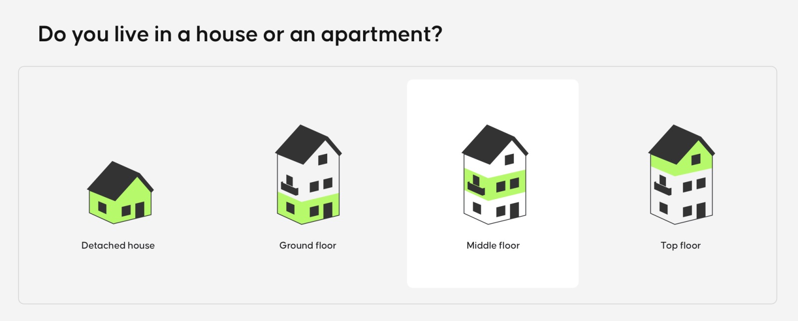
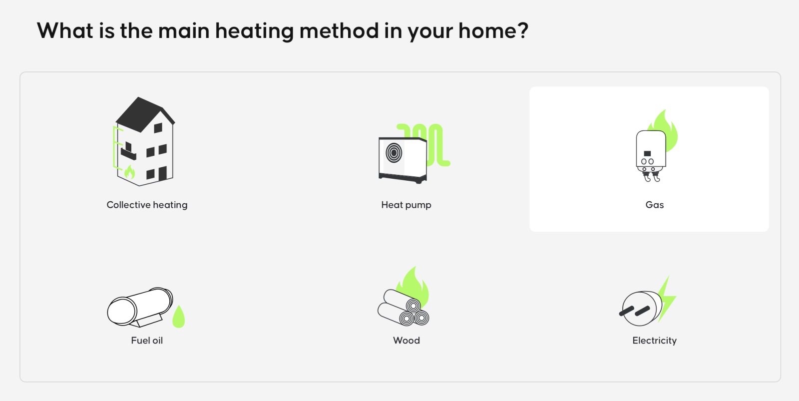
- Custom icon sets representing living environments and energy systems, creating a seamless user experience.
Creative Highlights
- Color Palette: The combination of vibrant greens and minimalist black-and-white tones reinforces the eco-friendly and innovative brand image.
- Typography: Clean sans-serif fonts contribute to the brand’s modern, accessible feel.
- Iconography: Custom minimalist icons enhance user navigation and clarity in ARP’s interfaces.
- Bus Stop Campaign: Engaging real-world touchpoints that connect potential customers to ARP’s digital ecosystem through QR codes.
Results
This project successfully positioned ARP as a forward-thinking leader in the energy efficiency market, establishing a clear and compelling identity aligned with its sustainable mission and technological expertise.
Work Performed
Brand Identity Design
Landing Page Design
Logo and Visual System Creation
Marketing and Advertising Materials
Digital User Interface Design
Iconography and Custom Visual Elements
Client
ARP